
–
ACCESSIBILITY
At Pride Winnipeg, we embrace accessibility as one of our core values.
ACCESSIBILITY AT THE FESTIVAL

Pride Winnipeg provides ASL services for all our events, including the Rally and Festival stage performances.

We offer a family friendly section at the main stage that has more space, front of stage access that is equipped with tables for your comfort.

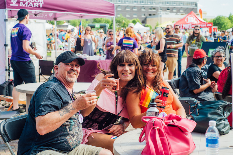
We offer an accessible entrance and an accessible bar in the beverage tent and the Liquor Mart patio for easier access.

At the information tent you can get information, find volunteer support, leave feedback, or ask any questions that you have.

Join us in the Quiet Zone located in the Manitoba Teachers’ Society Classroom at the Canadian Museum of Human Rights to enjoy a sensory-friendly space, complete with a live video/audio feed of our Main Stage performances. Limited space; visitors are asked to limit their stay to a reasonable amount of time to allow others to relax and unwind as needed. Please limit the use of scented products and common allergens as much as possible. Ear plugs, masks, and hand sanitizer will be provided!

Accessible Viewing Area at the Parade – Pride Winnipeg has partnered with True North Sports and Entertainment and Canada Life Centre to provide an accessible, climate controlled viewing area for this year’s parade! Registration is highly recommended.
DIGITAL ACCESSIBILITY
-
Caption and Alt Text
Images or videos used on social media, websites, and other digital applications should have alt- text written. This ensures accessibility to the content of the image or video to people with visual impairment. For Instagram specifically the alt-text functionality doesn’t work for all individuals, so an image/video description should be used at the bottom of the message.
-
Font Size
To ensure readability, the minimum font size should be 12pt. (Exceptions include footer or header notes in text-heavy documents, for example.) Ensure noticeable difference between title and body copy size to create visual hierarchy.
-
Colour Usage
When it comes to colour usage, the goal is to ensure enough contrast between element (font, icon, etc.) and background for optimal readability. For elements that don't initially have enough contrast (e.g., yellow on white), we use other find ways to ensure readability, such as applying shadows, increasing element size, or using bold fonts.
-
Plain Language
All marketing and communications materials should meet Pride Winnipeg’s plain language standards. These materials cannot have a higher reading level than Grade 8.
Questions About Accessibility?
Our team is here to help you. Send us an email, and we'll get back to you as soon as possible.
accessibility@pridewinnipeg.com